Friday, May 30, 2014

Golden Hello and Good News!


Hey everyone!  Thought I would just pop in quickly to share a card a made a while back for a call that didn't get picked up....can you guess the theme?

It was gold!

I started by embossing my cardstcok using that great Maggie Holmes Doily folder, and then I added gold accents with my Delicata ink pad.

The hello was cut with gold foil cardstock.

I wanted to use some gold ribbon, but couldn't find anything that matched, so I just cut a strip of cardstock and used my ink pad to color it.

Then I added some clear sequins layered with gold sequins.  I'm going to link this up over at Simon Says Stamp since it's Anything Goes week.


And I mentioned good news, right?  Well, I found out this morning that I made the Gallery Idol cut and am through to the next round.  Thanks so much to everyone who voted!  I've already started brainstorming for the next challenge - stencils!

Come back Monday to see what I created and have a wonderful weekend!

Supplies Used
Paper/Cardstock:  Avery Elle - Whipped Cream; LCI - Bubinga Woodgrain Paper
Ink:  Tsukineko - Delicata Gold Ink
Other:  Mama Elephant - Hello Script Creative Cut; Crate Paper - Styleboard Doilies Embossing Folder; Large clear and gold sequins; Tombow - Mono and Multi Mono Adhesive

Wednesday, May 28, 2014

Love Simon


Just popping in to share a quick and easy card that I'm going to link up over at Simon Says for their Anything Goes challenge.  They also have a new Work it Wednesday post up on the blog, so I'm going to link up there too.

I used the Kelly Purkey Chevron stencil with some Teresa Collins embossing paste.  That paste stinks to high heaven, but it is so smooth and spreads like buttah!  I'm a fan, I can deal with icky smells.....I changed diapers for five years.....

ANYWAY, some offset Avery Elle love die cuts and a few veneer hearts finished it off.


Like I said, really quick today.

AND, if you haven't had the chance to vote yet, I'd love it if you would click over to the gallery and take a gander....link is over there at the top right of my blog.  I'm hoping to stay in the competition for a while!  You do have to register (I know, total pain) but that just keeps people from voter fraud ;)

Have a great rest of your Wednesday!

Supplies Used
Paper/Cardstock:  Avery Elle - White and Pixie cardstock; LCI - Bubinga Woodgrain Paper
Other:  Simon Says Stamp - Kelly Purkey Chevron Stencil; Avery Elle - Simply Said Love Ellements Die; Teresa Collins - Embossing Paste; Studio Calico - Atlantic Wood Veneer Hearts; CTMH - Dimensional Foam Tape; Tombow - Mono and Multi Mono Adhesive

Monday, May 26, 2014

Gallery Idol Round 2!


I'm thrilled to have been chosen as one of the Top 20 finalists for this year's Gallery Idol competition.  If you're not familiar with the competition it's like American Idol for cards.  There's a challenge each week that is issued on Friday morning, the contestants have the weekend to create a card that meets the challenge, and then the public gets to vote on them.  Each Friday the field is narrowed by five until the ultimate winner is chosen.

The theme for this round was die cutting, which leaves a lot of room for interpretation.  My card is a die cutting version of spotlight stamping.

I started from the inside and worked out.  First, I created a watercolor sky background using Inktense pencils, and then die cut the pennant shape.  Then I placed the skyline die over the bottom of the pennant and ran it through my machine which leaves the empty negative space.  I had previously cut the skyline in dark gray cardstock.  I adhered some scratch printer paper to the bottom of the pennant, placed the skyline in like a puzzle, added the pennant die over top of that and die cut again to remove the excess skyline portions.  This process was repeated for each of the inlaid elements on the tag.

It would definitely be easier to build the whole scene at one time and cut the pennant once, but my creative process is not so organized as that.

Once I had the pennant done, I started working on the card base.  I first die cut and inlaid the skyline on the base.  Then I used that to line up the pennant to place the clouds.  This is a little tricky, but you use the grooves to make sure your die is in the right place, and then hold it down on the base part of the card and slide the pennant out and die cut.

The overlapping clouds required an extra die cut on both the pennant and base, but it's worth it.  Incidentally if you have the Lil Inker cloud dies that I used, you might be wondering how I did this because the clouds are actually fully attached.....I have some heavy duty kitchen scissors that I used to cut them apart.

At this point I had most of the card done.  I embossed the sentiment, from my Neat & Tangled Clouds set, on the sentiment piece, and added some rays using a Crafter's Workshop stencil, distress marker and waterbrush, and finished it with a little die cut heart as an accent.


Both the pennant and sentiment panel are popped out with foam tape for some dimension as is the little heart.

Sorry this is so wordy, but it was a bit complicated to put together, so I wanted to make sure to explain as best as possible.

Be sure to check out all the cards in the gallery, this is on talented group and I know you will be wowed, and of course, I'd love it if you would vote for my card!

Supplies Used
Paper/Cardstock:  Avery Elle - White, Fog, and Cherry Cardstock; MFT - Steel Grey cardstock; CTMH - White Daisy Cardstock
Stamps:  Neat & Tangled - Clouds
Ink:  Versamark
Other:  Paper Smooches - Super 2 and Hearts dies; MFT - Die-namics Jumbo Fishtail Banner STAX; Lil Inker Designs - Rainbows and Clouds Die Set; The Crafter's Workshop - Mini Stripes Explosion Stencil; Derwent - Inktense pencils; Ranger - Squeezed Lemonade Distress Marker and Waterbrush; Stampendous - White Embossing Powder; CTMH - Dimensional Foam Tape; Tombow - Stamp Runner; Kuretake - Glue Pen


Friday, May 23, 2014

Neat & Tangled Release Week Winner!

Hey everyone!

Just popping in to share the winner of my release week giveaway.

Random chose Day #4, and comment #14, which belongs to.....

SHELLY!!!

Congrats Shelly, shoot me your address and I'll get this out to you.

Thanks for all the wonderful comments this week!

Thursday, May 22, 2014

Neat & Tangled Release - Clouds - Last day for Giveaway


Hello!  So happy to reveal my second set from this release!  Meet Clouds:


I love to doodle and for whatever reason clouds are often the subject.  For this set I wanted to combine more streamlined outer lines with doodled/sketched interiors.

For today's card, I colored N&T's sunburst stamp with distress markers along the edges of the rays, and after stamping on the cardstock panel, I used a waterbrush to soften the lines and spread the color out a bit.  It was a little more subtle than I wanted, so I went back in and added some extra definition with the marker.

The panel was trimmed down and distressed on the edges.

The clouds are stamped with Versafine Smokey Grey and fussy cut, and I used Smokey Grey for the sentiment too.

The bottom cloud was adhered directly to the panel while the second was popped up.  I thought the sunburst panel needed something to anchor it, so I added a very thin strip of cardstock to the bottom.  A pale blue cardstock was the perfect way to finish it off, gives the hint of sky without any real sky.

Be sure to head over to the Neat & Tangled blog to check out the design team projects and enter to win a set.

I'm also hosting a giveaway here.  Leave a comment on any or all of this week's release posts and I'll pick one lucky commenter to receive one of my new sets.  I'll be back tomorrow to announce the release week winner!

Supplies Used
Paper/Cardstock:  Avery Elle - White, Sea Glass, and Fog cardstock
Stamps:  Neat & Tangled - Silver Linings and Sunburst
Ink:  Versafine - Smokey Grey
Other:  Ranger - Squeezed Lemonade Distress Marker and Waterbrush; CTMH - Dimensional Foam Tape; Tombow - Mono Adhesive

Wednesday, May 21, 2014

Same stamp watercolored two ways


I've been neglecting my watercolor class, so I thought would try and squeeze in at least a few more cards before the gallery closes.

It's interesting because flowers seem to lend themselves best to watercoloring techniques, or at least that's what any of the examples are of, but I tend not to be a huge flower person, so I've got a limited number of stamps to choose from.

Today I decided to use this gorgeous bloom from a retired The Craft's Meow stamp set, and I ended up using it for both the techniques I tried.

The first card is a technique that Tasnim demonstrated for faux hand painting....I started out following along....in her technique it's a very subtle coloring and you kind of pool the water/color and push it around to get the shading.

I think partly because I'm too impatient to let things dry and partly because I was looking for a bit more shading, once I did the initial layer of watercolor, I ended up going back in and adding more layers of color with a dryer brush to get more saturation.  I need to try the other technique again, the class technique is a bit more elegant and refined, but I'm pretty pleased with how this turned out.  I used Inktense pencils to color this one.


The second technique was one which Jennifer McGuire showed where she used a product that I don't own as the 'water' to add sparkle to the coloring/painting of an embossed image using markers as the medium.  I used perfect pearls in my water, as she suggested, to mimic that product, and I have to say that this was so quick and easy I ended up making ten panels that will be a set of cards for one of the girls' teachers at the end of this year.

That's all for now, come back tomorrow for the final day of the N&T release....where you get to see my second set!

Supplies Used
Paper/Cardstock:  PTI - Kraft cardstock; Watercolor paper from Target
Stamps:  The Craft's Meow - not sure the name of the set, but it was by Nina B; Avery Elle - O Happy Day
Ink:  Versafine and Versamark
Other:  Ranger - Distress Markers and Perfect Pearls; Derwent - Inktense Pencils; Stampendous - White Embossing Powder; Tombow - Stamp Runner

Neat & Tangled Release - So Very Blessed


I'm such a fan of Danielle's hand lettered sentiment minis, and this new one might be my favorite yet.


I embossed the sentiment in white, and then I added color using distress inks and a waterbrush.  I first colored in the obvious elements  - the little laurels surrounding the phrase, but then I decided I wanted them to pop a bit more, so using the waterbrush, I very carefully added an outline to each of the elements.


The white mat was adhered directly to the card base and I popped out the stamped panel.

Be sure to go over to the Neat & Tangled blog

to see what the design team created and enter to win this set.

In addition, remember that I'm selecting one lucky commenter from all the N&T release posts here on my blog this week to win one of my new sets.  Come back tomorrow to see the last set!

Supplies Used
Paper/Cardstock:  PTI - Kraft; CTMH - White Daisy
Stamps:  N&T - So Very Blessed
Ink:  Versamark; Ranger - Salty Ocean, Picked Raspberry, and Mowed Lawn Distress Inks
Other:  Stampendous - White embossing powder; Ranger - Waterbrush; CTMH - Dimensional Foam Tape; Tombow - Mono Adhesive

Tuesday, May 20, 2014

Neat & Tangled Release - Sunday School Songs


Hey everyone!  I'm so excited to share today's release with you as it's one of the ones I designed.


I wanted to share a different way to use the sets today, so I created some bookmarks.  These would be great little gifts for kids in a Sunday School or VBS class, and they are quick and easy to put together.


This first one was really simple, I just colored two shades of distress markers onto an acrylic block, spritzed and placed the top edge of my bookmark onto the block.  This was repeated at the bottom, and once dry, the sentiment was stamped.


For this one I used the coordinating heart stamp to create the background.  I spritzed a block which plain water and added just a tiny bit of pink distress ink so I could see the outline of the heart when I stamped it.  The distress ink pad was pressed onto a separate acrylic block, and using that ink and a waterbrush, with the stamped water hearts as a guide, I colored the hearts in with the distress ink.  Once dry, I stamped the sentiment and added a little color with distress markers.


Finally, my favorite.  The earth stamp was colored with a green distress marker and stamped onto the bookmark.  Using a waterbrush I added blue distress ink to create the ocean, and also added a bit of texture/filled in the land portions as needed.  Once dry, I stamped the sentiment and added color to the open letters.

I created some twine pom poms as accents.  I think if I make these again I'll use yarn as the twine pom poms aren't as full as I'd like.

Please head over to the Neat & Tangled blog to check out all the projects over there.  Plus, Danielle is giving away a set. 

Leave a comment here too, I'll be choosing one lucky commenter from all my release posts this week to win one of my new sets.

Supplies Used
Paper/Cardstock:  Watercolor paper from Target
Stamps:  Neat & Tangled - Sunday School Songs
Ink:  Versafine; Ranger - Mowed Lawn, Salty Ocean. Evergreen Bough, and Picked Raspberry Distress Ink
Other:  Ranger - Distress Markers and Waterbrush; Divine Twine - Blue, Green and Solid Pink Divine Twine

Monday, May 19, 2014

Neat & Tangled Release Week - Photo Booth - Giveaway this week


Hey everyone!

It's release week at Neat & Tangled.  I'm so excited to be participating in release week with the ladies at Neat & Tangled this week especially since I'm releasing two new sets this week.

Today's featured set is from Danielle and it's called Photo Booth.


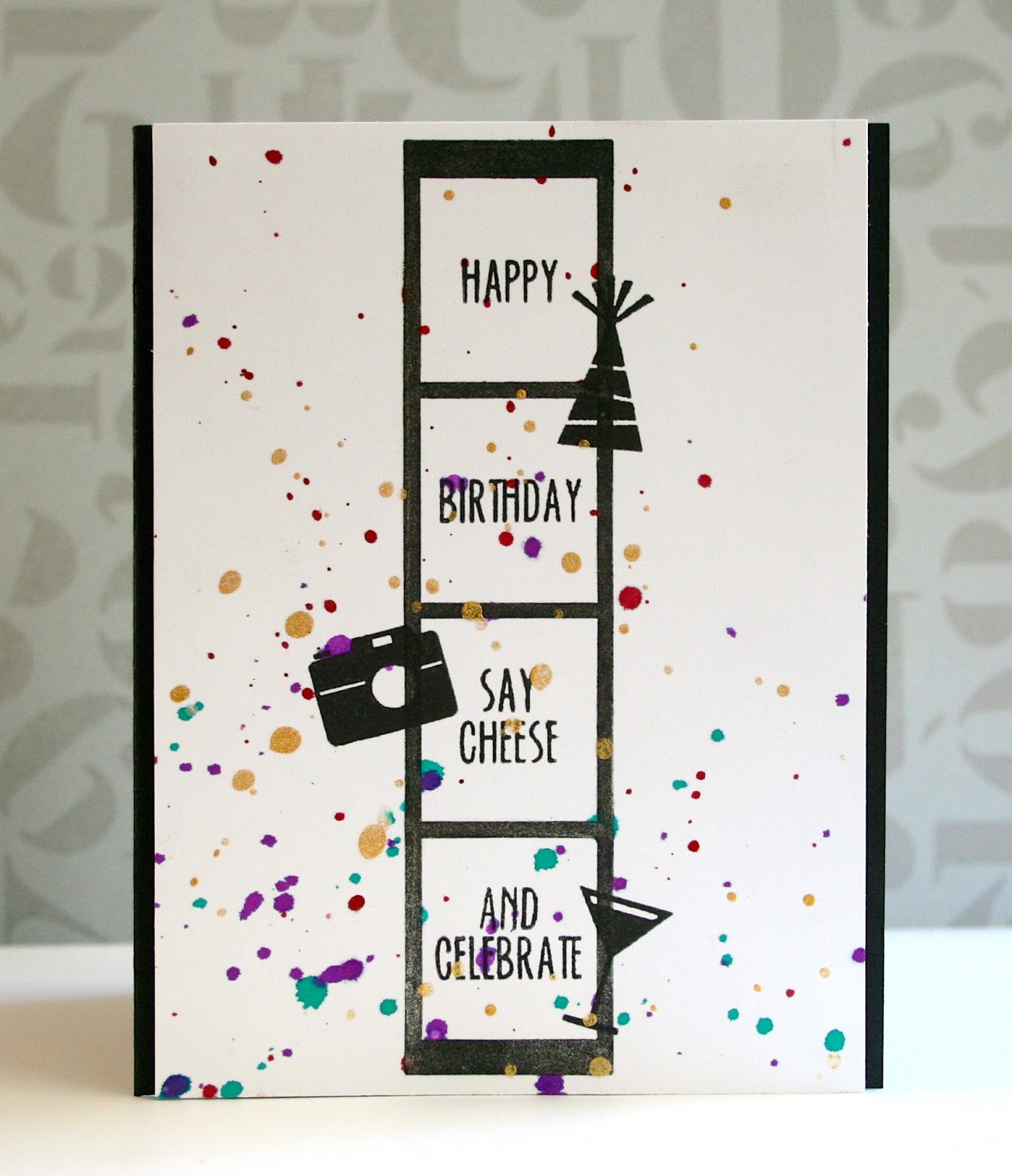
In addition to the photo strip, there are a ton of sentiments in this set, and some great icons - this will be perfect for you Project Lifers as well as the card makers!

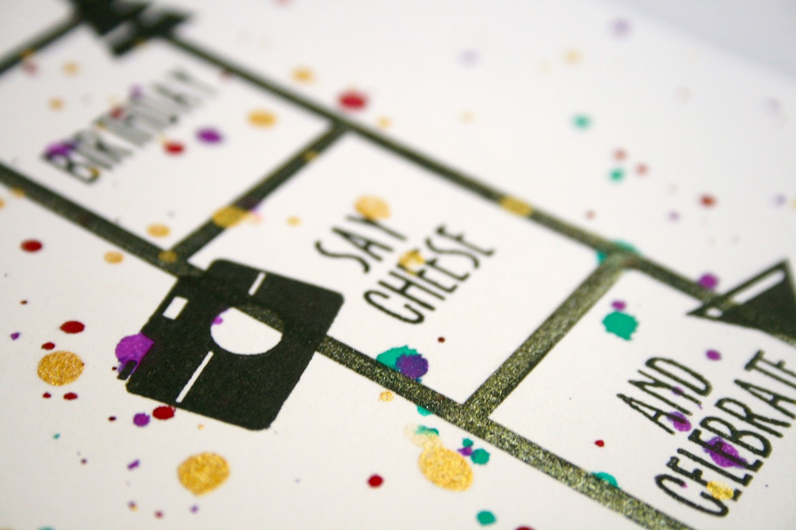
I wanted to feature that great photo strip, and show how you can combine the sentiments.  I stamped the photo strip and then added Wink of Stella accents to it.  Then I stamped the sentiments and the icons right over the photo strip.  It's hard to see in the photo, but the solid black is a good contrast to the sparkle from the photo strip.


It was looking a little too CAS for my taste, so I added some liberal splattering using mists.

Make sure you head over to the Neat & Tangled blog to see what the design team created and leave a comment because Danielle will be giving away one of each of the sets released this month there.

Oh, I mentioned a giveaway right?  Just leave a comment on any of the release week posts (today through Thursday), and on Friday I'll announce a winner who will receive their choice of my new sets.

Come back tomorrow for my first set reveal!

Supplies Used
Paper/Cardstock:  CTMH - White Daisy; PTI - True Black
Stamps:  Neat & Tangled - Photo Booth
Ink:  Versafine
Other:  Zig - Wink of Stella Pen; SC - Mister Huey's Plum Thumb mist; Ranger - Crushed Grape and Vibrant Turquoise Spray Ink; Heidi Swapp - Gold Mist; AC - This to That dimensional foam adhesive

Sunday, May 18, 2014

How R U


I have to say that I was having a really hard time with the washi theme for this year's Gallery Idol first round challenge.  I have lots of washi, but I find that I don't use it much.  

But, I decided that if I could come up with an idea that really got me excited - something unique and different - that I would throw my hat in the ring.  

So here you have that card, my one and only entry into the competition this year.  Whether or not it gets picked up I have to say I love it and I loved the creative process that went into it.

I decided I wanted to piece an image with washi.  I've done this before using the technique I learned here, but sorting through my stamps, I just didn't find one that was speaking to me.  And then I found this pin, and I knew it was going to be the death of me to make a card like that, but I just had to try.

I used the same basic outer shape for the different continents, although I simplified them as I started to sketch in the inner lines.  I tried to simplify those as well since I knew I was going to be piecing with washi and didn't want to have to do a ton of teeny tiny pieces.  Once I had the lines set in pencil (with much erasing and changing) I used a ruler and fine Sharpie to draw them all in.  Then I went to work with a pile of washi and cutting knife.  

Piecing with washi is tricky work, you have to cut through the washi, but you don't want to mess up the paper underneath.  I tried to keep patterns to a minimum, and use smaller ones or some that read more as solids from a distance, and there are plenty of solid washi tapes in there too.  


A very simple sentiment from Altenew finished it off.  

That's all for today.  Tomorrow is release week at Neat & Tangled....if you follow me on FB or Instagram you may have seen some sneaks I've posted....I've got two new sets releasing and I'll be joining in on all the release week fun over there, so please be sure to come back tomorrow to check it all out!

Supplies Used
Paper/Cardstock:  CTMH - White Daisy cardstock; Avery Elle - Mimosa cardstock; PTI - True Black cardstock
Stamps:  Altenew - Label Love
Ink:  Versafine
Other:  A whole lot of washi; CTMH - Cutting Knife; Extra fine Sharpie; Tombow - Stamp Runner

Saturday, May 17, 2014

Oh Happy Day for The Crafter's Workshop


I'm so excited to be sharing my first guest post for The Crafter's Workshop!  Today I am sharing a simple technique that doesn't require much in the way of supplies and allows you to stretch your stencils to get a totally different look from them.  This technique is especially applicable to more open stencils, and would also be perfect for Balzer Bits and Ronda's Fragments.  

This is the stencil I used, Julie Balzer's Stick Flowers:


While the pattern covers the entire 6x6 stencil I used just the bottom right corner to create my card.

After carefully studying the stencil and deciding which part I wanted to use, I placed it over my cardstock panel, taped it down and very lightly traced around the selected portions of the stencil, and then colored the image in with Copics.  This was a little more time consuming than I thought because you have to be very careful since you just have that very thin pencil line as a guide, but the results are well worth it.

I colored in stages since I wanted the inner sections to be completely dry before I colored the outer layer to prevent cross bleeding.  I first colored the inside of the flowers, then the inside of the leaves, then the stems/outer leaves, and then the outer flower layer.  If you don't have a lot of markers, no worries....I only used five on this card.  Two shades of red for the flowers, the inner portion was shaded and I used the lighter red for the outer layer as well, two shades of green for the inner leaves and one very light shade of green for the stems/outer leaves.


I love the clean Scandinavian feel of the card, and wanted to preserve that look with a simple sentiment and pale blue base.  I let it sit overnight and then went back and erased any of the pencil lines that were still showing.

Thanks so much for stopping by!

Supplies:
The Crafter's Workshop - Mini Stick Flowers

Avery Elle Oh Happy Day Stamp Set
Copics - R22, R24, G40, G43, G46
Memento Tuxedo Black Ink
Bazzill Card Shoppe and Crafter's Companion Cardstock
Tombow Mono Adhesive

Thursday, May 15, 2014

RCC91 - Party Time!


I'm so happy that the Ribbon Carousel Challenge is back, and this month in honor of the Ribbon Carousel's third birthday, the theme is Party Time.

Your card doesn't have to be a birthday card, a card celebrating any holiday or occasion will do.  

One lucky participant this month will win their own Ribbon Carousel!  


 There are only four (4) rules you must follow to be eligible for the prize:

  1. You MUST use ribbon, twine, thread, washi tape or anything that comes on a spool on your creation
  2. Your project must be based on the theme of the month.
  3. You must add a NEW project to the inlinkz at the Ribbon Carousel Challenge blog
  4. You may enter the challenge 3 times maximum to be qualified to win a prize.
On to my card, as you may have noticed, there has been a lot of watercoloring here lately and today's card is no exception.  I'm using a technique from Day 5 of OCC's Watercolor class, watercoloring embossed images.  


The sample shown in class was a background, so the colored spaces were relatively small and similarly sized.  This is more a focal image so there's more of a variation in the size of the colored areas, but it works just as well.

I love the soft airy look of it, although you could certainly go much bolder with your colors.  Once I was done I wanted to get the image a little more definition, so similar to how you trace around an image with a light gray/blue when coloring with markers, I added a little shadow around the shapes and sentiment.  


A little Divine Twine finished the card off.

Hope you will play along with the challenge this month!

Supplies UsedPaper/Cardstock:  Avery Elle - Silver Fox Cardstock; Strathmore - Mixed Media paperStamps:  Jane's Doodles - Party TimeInk:  VersamarkOther:  Ranger - Distress Markers and Water brush  Stampendous - White Embossing Powder; Divine Twine - Deep Pink Solid Twine; Tombow - Stamp Runner

Tuesday, May 13, 2014

Woodgrain Thanks - and an answer


Just popping in quickly to share another card from my Watercolor class.

This is a basic background technique where you load up your stamp with color, spritz liberally with water, and then place paper on it.

In this case I used Vintage Photo Distress Ink and an A Muse Studio background.

Love how the background turned out.  I kept it really CAS, partly because I've got all sorts of projects to get done, so it looks like I'm going to be falling a little further behind on my homework, but wanted to at least get this one done.

Since I'm overly matchy matchy, I colored the edges of the card base as well as the sentiment strip with my Vintage Photo ink pad.

And now for the answer for all those who guessed at my Mother's Day question from yesterday.....the comments were pretty evenly split between not sleeping in and not getting the remote.....the answer is.....no sleeping in.  :(  The girls didn't come in and jump on the bed, but their bedroom is just across the hall from ours, and let's just say there was some very loud singing Sunday morning......

Supplies Used
Paper/Cardstock:  Avery Elle - White Cardstock; Watercolor paper from Target
Stamps:  A Muse - Redwood Background
Ink: Distress Ink - Vintage Photo
Other:  Lily Bee - Alpha Sheet; Tombow - Stamp Runner; CTMH - Dimensional Foam Tape

Monday, May 12, 2014

A couple more watercolor cards


Still working through some of the different techniques from the watercolor class.

This first card is one of the Day 2 techniques.  I used something called Frisket to mask off the stamped image and then colored over it with a wash of watercolors.  Then you just peel away the Frisket and voila!  I really love this technique, and will definitely be trying it again.

Next a technique from Day 4 taught by Julie Ebersole.  She used a pencil eraser to stamp little circles and the whole time she was doing it I kept thinking that it looked like the balloons from the movie Up.  Turns out her card involved a butterfly, so naturally I had to recreate the balloons in my card.


It didn't turn out exactly like I envisioned.  For whatever reason, my eraser stamping wasn't as juicy, maybe it's because I used a cheap pencil that I 'borrowed' from Ellie.  This is one of those cards where I kept thinking it needed a little something more, and I'm not sure I got it quite right, but I decided I should quite while I was ahead.

Hope you had a nice weekend.  Ours was a little crazy.  I think the girls were getting all their 'bad' out on Saturday in preparation for Sunday.  Sunday was nice and relaxing, here's a picture of me and my girls.


I wanted three things for Mother's Day:  1) to sleep in, 2) not to cook anything, and 3) I wanted the remote.  I got two of those three things....who can guess what didn't happen?

Supplies Used
Card 1
Paper/Cardstock:  PTI - Kraft cardstock; Watercolor paper from Target
Stamps:  Hero Arts - Typewriter Notes
Ink:  Versafine
Other:  Derwent - Inktense pencils; AC - This and That dimensional adhesive
Card 2
Paper/Cardstock:  Avery Elle - Cherry Cardstock; Watercolor paper from Target
Stamps:  LID - Rainbows & Clouds Sentiments
Ink:  Versafine; Distress Inks - Salty Ocean; Mowed Lawn; Festive Berries; CTMH - Dutch Blue
Other:  Distress Markers - Squeezed Lemonade, Spiced Marmalade; AC - Ready Set Go Puffy Stickers, Black 03 Journaling Pen; Neat & Tangled - Clear Sequins; Webster's Pages - Recorded Washi

Sunday, May 11, 2014

Watercolor + Font Focus for Verve


I created the soft and subtle background for this card using the technique Aga demonstrated in the Watercolor for Cardmakers class.

I thought I would use it, combined with the watercolor technique demonstrated here to create a card for Verve's Font Focus challenge.


The challenge is to make the sentiment(s) the focus of your card, so I went very clean and simple.  Once my background (created with Inktense pencils) was completely dry, I inked up my stamp with a variety of Distress Inks and stamped on the panel.  Then I misted it with water so it bled a little, used a heat gun to speed up with drying, inked up the sentiment again with Versafine and stamped over the original.

Really quick and easy, but the verse definitely shines here.  I added a little sheer ribbon and rounded a couple of the corners to add some extra interest.

Thanks for coming by, I hope you are having a great weekend/mother's day!

Supplies Used
Paper/Cardstock:  Bazzill Card Shoppe - Candy Necklace Cardstock; Watercolor paper from Target
Stamps:  Verve - Jeremiah 29:11
Ink:  Distress Inks:  Salty Ocean, Evergreen Bough, Mowed Lawn, Iced Spruce; Versafine
Other:  Derwent - Inktense Pencils; American Crafts - Sheer Ribbon; CM - Corner Rounder; Tombow - Stamp Runner

Saturday, May 10, 2014

'Painted' Watercolor Cards


I'm a bit behind on my watercolor homework, so I gave myself permission to work on it out of sequence.

These cards use a technique that Sanketi taught.  I've been a huge fan of her watercolored cards, so I was excited to see that she would be teaching.

This technique kind of reminds of no-line Copic coloring where you stamp with a light ink, and it kind of blends in to look like a non-stamped image.  Similar here, but with watercolors - the trick is to use a water soluble dye ink when you stamp the image.

I was having so much fun with this that I couldn't stop at just one card.

Sanketi's example has a much more dynamic background....I'm still a little timid with my backgrounds, I need to work on making them bolder and brighter, but I think these were good first tries.


I should also admit that I don't have true watercolors right now.  These were both done with my Inktense pencils...which I love to bits, but it's a little easier to do the painted effect when you can immediately dab into a little watercolor pan/pile of color as opposed to pulling color off a pencil....I had a bit of trouble controlling the amount of water because I was wetting the brush more than I would have otherwise to pick the color up off the pencil.

I've got a couple other cards halfway done, and I need to watch today's videos, so I'm going to sign off.  Hope you are having a great weekend!

Supplies Used:
Paper/Cardstock:  Avery Elle - Fog and Sea Glass Cardstock; CTMH - White Daisy cardstock; Watercolor Paper from Target
Stamps:  Unity - Wishing You Joy and Countryside Blooms Itty Bitties; WPlus9 - Quite Like You
Ink:  Distress Inks - Antique Linen and Vintage Photo; Versafine
Other:  Derwent - Inktense Pencils; Tombow - Stamp Runner; CTMH - Dimensional Foam Tape

Thursday, May 8, 2014

The First Day of First Grade


Another of the layouts I created for National Scrapbooking Day.  Since there's only a couple months left in the school year, I figured maybe I should get this one done.

I ask Ellie a series of questions on the first day of school, I actually record it, but I also make a layout.

This year I used Echo Park's Playtime collection.  Pretty simple and easy, but I think these layouts are going to be a great way to mark each year of school.

It was fun to watch the video again when I was making this layout.  You could definitely see the nerves.  I remember her being much more excited last year, and this year it was a lot more nervousness/anxiety.  But nothing to worry about, she's doing really well at school and adores her teacher.

I'm going to link this one up over at Moxie Fab World's Scrapbooking is Fun challenge.

I'm a little behind on my watercolor homework...hoping to get caught up the next couple days!

Wednesday, May 7, 2014

Jane's Doodles New Release Blog Hop


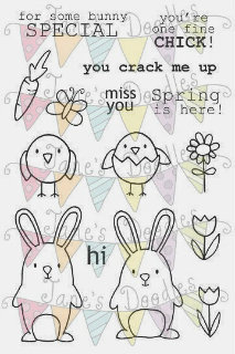
Hey everyone!  I'm so excited to be guest designing for Jane's Doodles today and participating in their new release blog hop.  I love Jane's stamps, and these sets are just so cute!  Here are the two new sets that are being highlighted today,  Spring and TEArrific:


For my first two cards I had fun combining the two sets because I just couldn't get enough of those bunnies.


I thought that stack of cups just needed a little bunny inside and I couldn't stop with just one, so I added a second bunny peeking out from behind the stack.  The bunnies were colored with Spectrum Noir markers, and I added a subtle wash of color to the background using Inktense pencils.

My second card paired up the stamps again, I thought the carrots would fit perfectly into the single tea cup.  The coloring on this one was done with both Spectrum Noir and Copic markers.


Finally, a card using just the spring set.  I was playing around with one of the single tulip stamps to create a flower burst pattern.  I think it looks kind of Scandinavian, and if you used different colors, these could totally pass for snowflakes too.


I used Copics to color this, and I couldn't find the right color of cardstock for the sentiment panel, so I just colored a white piece of cardstock to create my own.  It's a little hard to tell, but after the panel was dried and the sentiment stamped I felt like it needed a little more to it, so I stamped some of the tulips on the panel and lightly colored them with the light shades of Copics I had used for the other flowers.  It adds just a subtle variation in color.

That's all for me today.  I had such fun participating in the hop.  I'm a huge Jane's Doodles fan, so this was quite a thrill for me.  The full hop list is below.  Make sure you stop by and see all the wonderful projects, one lucky commenter will win both sets!

Jane http://janeb-myblog.blogspot.com

Renee http://www.reneedezember.blogspot.com/

Eva http://muffinspyssel.blogspot.com

Mariana http://marianagrigsby.wordpress.com

Aga http://justmadefrompaper.blogspot.com

Me http://mprantner.blogspot.com/

Ange http://www.angeliquekelly.blogspot.com/

Evgenia http://evgeniapetzer.blogspot.com/ 

Judith http://jgsnook.blogspot.com

Jane's Doodles blog http://janesdoodles.blogspot.com

Thanks so much to Jane for having me!!!

Tuesday, May 6, 2014

Watercolor Class Day 1 Homework and some Good News


I'm taking the new Watercolor class over at Online Card Classes and had the chance to work on some cards last night.  This first one is a technique that Jen Rzasa shared where you 'dress up' a watercolor wash by using a stencil on the watercolor while it is drying to create a subtle pattern.

I really like this subtle technique, you can see it at the bottom right portion of the card, I used The Crafter's Workshops Mini Hourglass stencil here.  When it was done, I thought it might look neat to have a more defined image at the top right....so they kind of fade together in the middle.  I didn't want it to be really defined, just more defined, so I just replaced the stencil and lightly added color starting at the top right.  


That gorgeous sentiment is from Neat and Tangled and a bit of AC glitter tape finishes it off.  

My second card is a riff on Laura Bassen's card, using a block to create a blended/ombre effect.  I've done similar techniques before, mostly adding multiple ink colors onto a block simultaneously as opposed to one layer at a time.


I thought it would be neat to create thinner layers, so I used a 1" x 6" block.  I like how it almost created the look of marble/limestone albeit in different colors.  The full panel was a bit much, so I broke it, adding a blank space for the sentiment in the middle, popping the watercolor panels out, and adding some black cardstock accents.  


One little hint - depending on the thickness of your paper and how saturated you get it, it can really warp/start to break down.  I mounted my watercolor papers on some scrap cardstock to give it a little extra strength since I wanted to pop those panels up.

Oh, and I mentioned some good news right?  There was a little whiff of it above in that first card.  I'm so excited to share that I was invited to be a guest designer over at The Crafter's Workshop this term.  Here's the official announcement.  TCW has some of my very favorite stencil designs/designers and I'm thrilled to part of the guest crew for this term.

That's all for me today.  Please come back tomorrow for a very special post!

Supplies Used
Card 1
Paper/Cardstock:  PTI - Black Cardstock; Strathmore - Mixed Media Paper
Stamps:  Neat & Tangled - My Favorite
Ink: Versafine
Other:  The Crafter's Workshop - Mini Hourglass Stencil;
Derwent Inktense Pencils; AC - Glitter Tape; Tombow - Mono Adhesive
Card 2
Paper/Cardstock:  Strathmore - Mixed Media Paper; Crafter's Companion - White Cardstock; PTI  Black Cardstock
Stampe:  Winnie & Walter - The Big, The Bold and the Happy
Ink:  Versafine; Ranger - Pickled Raspberry, Salty Ocean; Evergreen Bough; and Iced Spruce Distress Ink
Other:  Tombow - Mono Adhesive; CTMH - Dimensional Foam Tape

Monday, May 5, 2014

A Sweet Moment


Happily I was able to get some scrapbooking done this weekend for National Scrapbooking Day.  This is my favorite of the layouts I was able to get done.

The truth is this layout has been half done for at least three months, I had a bit of scrapper's block when I started it and set it aside, but I just love that big photo of Carina and one of my goals for this weekend was to finish this one up.

This layout truly is a Scrap Your Stash challenge.  I am honestly not quite sure of all the papers/supplies so I won't list everything at the end, but I know the base is Glitz, and there are some Bella papers, doilies from my stash, Amy Tangerine Thickers, and that pretty flower piece was gifted to my from a blog friend Sandy Ang.


These photos are from my younger sister's wedding rehearsal.  It's so hard to get a good photo of Carina these days, she's either not interested in cooperating, too busy to stop, or making her cheese face.  I just love how real and true her expression is.

I'm linking this up over at Moxie Fab World for the Scrapbooking Rocks challenge.  

I'll have another layout to share with you tomorrow.   Have a great start to your week!