Showing posts with label Online Card Classes. Show all posts

Thursday, March 26, 2015

One more Stretch Your Dies card


Hey everyone, just popping in really quickly to share one more card for the Stretch Your Dies class.  I have several additional techniques that I want to try, but it's been such a crazy month, I haven't been able to do as many 'extra' projects as I'd like, plus I've been in the mood to scrapbook and I've learned that if that's the case I should try and get as many layouts done as possible before the mood departs!

Anyway, I really wanted to try this technique for small dies that my friend Jen Rzasa taught.  You create some water color washes on cardstock (I used Strathmore Mixed Media paper) and then die cut your small dies.  Then you adhere them to create a background/custom patterned paper.


I found this a really fun and relaxing technique.  I love the wash from the colors.  Jen's card for class was very bright and festive, mine is bit more soft and calming.  I love how you can use the same technique for vastly different looks/feels.

I used Ellen Hutson's Hearth & Home dies and the sentiment is from their Cozy Christmas set.

That's all for now, I'll have another layout to share with you tomorrow.

Supplies Used
Paper/Cardstock:  Avery Elle - Silver Fox, White, and Chocolate cardstock; Strathmore - Mixed Media Paper
Stamps:  Essentials by Ellen - Cozy Christmas
Ink:  Versafine Smokey Grey
Other:  Essentials by Ellen - Home and Hearth dies; Derwent - Inktense Pencils; CTMH - Clear Embossing Powder; Tombow - Mono and Multi Mono Adhesive; AC - Foam Adhesive

Monday, March 23, 2015

Stretch Your Dies - Masking Stamped Images


I've been taking the Stretch Your Dies class from Online Card Classes and was finally able to work on some of the techniques this weekend.

This card uses the masking technique taught by Dawn Woleslage.  She featured a few ways to execute the technique and I combined a couple.  I started with inking, using a couple shades of distress ink.  I wanted some more texture though, so I also used ink sprays.  Rather than misting the entire panel, I used two colors and splattered.  


While Dawn used black ink for all the stamped images, I wanted a more colorful/less graphic look, so I stamped some of the images in color and some in black.  I also added a bit of doodling to the centers sprays in the solid flowers.

The stamps are from Ellen Hutson, and the die is Studio Calico.

This was a pretty quick and easy technique that I'll definitely be trying again.

Supplies Used
Paper/Cardstock - My Favorite Things - Sweet Tooth; PTI - True Black
Stamps:  Ellen Hutson - Bold Blooms
Ink:  Hero Arts - Raspberry Jame & Fresh Peach; ; Ranger - Picked Raspberry & Scattered Straw Distress Ink; Versafine
Other:  Ranger - Funky Fuchsia & Cherry Pie; Heidi Swapp - Gold Glimmer Mist; Studio Calico - Hello By Lindsay Letters Die; Scotch - Foam Adhesive; Tombow - Mono Adhesive

Wednesday, May 21, 2014

Same stamp watercolored two ways


I've been neglecting my watercolor class, so I thought would try and squeeze in at least a few more cards before the gallery closes.

It's interesting because flowers seem to lend themselves best to watercoloring techniques, or at least that's what any of the examples are of, but I tend not to be a huge flower person, so I've got a limited number of stamps to choose from.

Today I decided to use this gorgeous bloom from a retired The Craft's Meow stamp set, and I ended up using it for both the techniques I tried.

The first card is a technique that Tasnim demonstrated for faux hand painting....I started out following along....in her technique it's a very subtle coloring and you kind of pool the water/color and push it around to get the shading.

I think partly because I'm too impatient to let things dry and partly because I was looking for a bit more shading, once I did the initial layer of watercolor, I ended up going back in and adding more layers of color with a dryer brush to get more saturation.  I need to try the other technique again, the class technique is a bit more elegant and refined, but I'm pretty pleased with how this turned out.  I used Inktense pencils to color this one.


The second technique was one which Jennifer McGuire showed where she used a product that I don't own as the 'water' to add sparkle to the coloring/painting of an embossed image using markers as the medium.  I used perfect pearls in my water, as she suggested, to mimic that product, and I have to say that this was so quick and easy I ended up making ten panels that will be a set of cards for one of the girls' teachers at the end of this year.

That's all for now, come back tomorrow for the final day of the N&T release....where you get to see my second set!

Supplies Used
Paper/Cardstock:  PTI - Kraft cardstock; Watercolor paper from Target
Stamps:  The Craft's Meow - not sure the name of the set, but it was by Nina B; Avery Elle - O Happy Day
Ink:  Versafine and Versamark
Other:  Ranger - Distress Markers and Perfect Pearls; Derwent - Inktense Pencils; Stampendous - White Embossing Powder; Tombow - Stamp Runner

Thursday, May 15, 2014

RCC91 - Party Time!


I'm so happy that the Ribbon Carousel Challenge is back, and this month in honor of the Ribbon Carousel's third birthday, the theme is Party Time.

Your card doesn't have to be a birthday card, a card celebrating any holiday or occasion will do.  

One lucky participant this month will win their own Ribbon Carousel!  


 There are only four (4) rules you must follow to be eligible for the prize:

  1. You MUST use ribbon, twine, thread, washi tape or anything that comes on a spool on your creation
  2. Your project must be based on the theme of the month.
  3. You must add a NEW project to the inlinkz at the Ribbon Carousel Challenge blog
  4. You may enter the challenge 3 times maximum to be qualified to win a prize.
On to my card, as you may have noticed, there has been a lot of watercoloring here lately and today's card is no exception.  I'm using a technique from Day 5 of OCC's Watercolor class, watercoloring embossed images.  


The sample shown in class was a background, so the colored spaces were relatively small and similarly sized.  This is more a focal image so there's more of a variation in the size of the colored areas, but it works just as well.

I love the soft airy look of it, although you could certainly go much bolder with your colors.  Once I was done I wanted to get the image a little more definition, so similar to how you trace around an image with a light gray/blue when coloring with markers, I added a little shadow around the shapes and sentiment.  


A little Divine Twine finished the card off.

Hope you will play along with the challenge this month!

Supplies UsedPaper/Cardstock:  Avery Elle - Silver Fox Cardstock; Strathmore - Mixed Media paperStamps:  Jane's Doodles - Party TimeInk:  VersamarkOther:  Ranger - Distress Markers and Water brush  Stampendous - White Embossing Powder; Divine Twine - Deep Pink Solid Twine; Tombow - Stamp Runner

Tuesday, May 13, 2014

Woodgrain Thanks - and an answer


Just popping in quickly to share another card from my Watercolor class.

This is a basic background technique where you load up your stamp with color, spritz liberally with water, and then place paper on it.

In this case I used Vintage Photo Distress Ink and an A Muse Studio background.

Love how the background turned out.  I kept it really CAS, partly because I've got all sorts of projects to get done, so it looks like I'm going to be falling a little further behind on my homework, but wanted to at least get this one done.

Since I'm overly matchy matchy, I colored the edges of the card base as well as the sentiment strip with my Vintage Photo ink pad.

And now for the answer for all those who guessed at my Mother's Day question from yesterday.....the comments were pretty evenly split between not sleeping in and not getting the remote.....the answer is.....no sleeping in.  :(  The girls didn't come in and jump on the bed, but their bedroom is just across the hall from ours, and let's just say there was some very loud singing Sunday morning......

Supplies Used
Paper/Cardstock:  Avery Elle - White Cardstock; Watercolor paper from Target
Stamps:  A Muse - Redwood Background
Ink: Distress Ink - Vintage Photo
Other:  Lily Bee - Alpha Sheet; Tombow - Stamp Runner; CTMH - Dimensional Foam Tape

Monday, May 12, 2014

A couple more watercolor cards


Still working through some of the different techniques from the watercolor class.

This first card is one of the Day 2 techniques.  I used something called Frisket to mask off the stamped image and then colored over it with a wash of watercolors.  Then you just peel away the Frisket and voila!  I really love this technique, and will definitely be trying it again.

Next a technique from Day 4 taught by Julie Ebersole.  She used a pencil eraser to stamp little circles and the whole time she was doing it I kept thinking that it looked like the balloons from the movie Up.  Turns out her card involved a butterfly, so naturally I had to recreate the balloons in my card.


It didn't turn out exactly like I envisioned.  For whatever reason, my eraser stamping wasn't as juicy, maybe it's because I used a cheap pencil that I 'borrowed' from Ellie.  This is one of those cards where I kept thinking it needed a little something more, and I'm not sure I got it quite right, but I decided I should quite while I was ahead.

Hope you had a nice weekend.  Ours was a little crazy.  I think the girls were getting all their 'bad' out on Saturday in preparation for Sunday.  Sunday was nice and relaxing, here's a picture of me and my girls.


I wanted three things for Mother's Day:  1) to sleep in, 2) not to cook anything, and 3) I wanted the remote.  I got two of those three things....who can guess what didn't happen?

Supplies Used
Card 1
Paper/Cardstock:  PTI - Kraft cardstock; Watercolor paper from Target
Stamps:  Hero Arts - Typewriter Notes
Ink:  Versafine
Other:  Derwent - Inktense pencils; AC - This and That dimensional adhesive
Card 2
Paper/Cardstock:  Avery Elle - Cherry Cardstock; Watercolor paper from Target
Stamps:  LID - Rainbows & Clouds Sentiments
Ink:  Versafine; Distress Inks - Salty Ocean; Mowed Lawn; Festive Berries; CTMH - Dutch Blue
Other:  Distress Markers - Squeezed Lemonade, Spiced Marmalade; AC - Ready Set Go Puffy Stickers, Black 03 Journaling Pen; Neat & Tangled - Clear Sequins; Webster's Pages - Recorded Washi

Sunday, May 11, 2014

Watercolor + Font Focus for Verve


I created the soft and subtle background for this card using the technique Aga demonstrated in the Watercolor for Cardmakers class.

I thought I would use it, combined with the watercolor technique demonstrated here to create a card for Verve's Font Focus challenge.


The challenge is to make the sentiment(s) the focus of your card, so I went very clean and simple.  Once my background (created with Inktense pencils) was completely dry, I inked up my stamp with a variety of Distress Inks and stamped on the panel.  Then I misted it with water so it bled a little, used a heat gun to speed up with drying, inked up the sentiment again with Versafine and stamped over the original.

Really quick and easy, but the verse definitely shines here.  I added a little sheer ribbon and rounded a couple of the corners to add some extra interest.

Thanks for coming by, I hope you are having a great weekend/mother's day!

Supplies Used
Paper/Cardstock:  Bazzill Card Shoppe - Candy Necklace Cardstock; Watercolor paper from Target
Stamps:  Verve - Jeremiah 29:11
Ink:  Distress Inks:  Salty Ocean, Evergreen Bough, Mowed Lawn, Iced Spruce; Versafine
Other:  Derwent - Inktense Pencils; American Crafts - Sheer Ribbon; CM - Corner Rounder; Tombow - Stamp Runner

Saturday, May 10, 2014

'Painted' Watercolor Cards


I'm a bit behind on my watercolor homework, so I gave myself permission to work on it out of sequence.

These cards use a technique that Sanketi taught.  I've been a huge fan of her watercolored cards, so I was excited to see that she would be teaching.

This technique kind of reminds of no-line Copic coloring where you stamp with a light ink, and it kind of blends in to look like a non-stamped image.  Similar here, but with watercolors - the trick is to use a water soluble dye ink when you stamp the image.

I was having so much fun with this that I couldn't stop at just one card.

Sanketi's example has a much more dynamic background....I'm still a little timid with my backgrounds, I need to work on making them bolder and brighter, but I think these were good first tries.


I should also admit that I don't have true watercolors right now.  These were both done with my Inktense pencils...which I love to bits, but it's a little easier to do the painted effect when you can immediately dab into a little watercolor pan/pile of color as opposed to pulling color off a pencil....I had a bit of trouble controlling the amount of water because I was wetting the brush more than I would have otherwise to pick the color up off the pencil.

I've got a couple other cards halfway done, and I need to watch today's videos, so I'm going to sign off.  Hope you are having a great weekend!

Supplies Used:
Paper/Cardstock:  Avery Elle - Fog and Sea Glass Cardstock; CTMH - White Daisy cardstock; Watercolor Paper from Target
Stamps:  Unity - Wishing You Joy and Countryside Blooms Itty Bitties; WPlus9 - Quite Like You
Ink:  Distress Inks - Antique Linen and Vintage Photo; Versafine
Other:  Derwent - Inktense Pencils; Tombow - Stamp Runner; CTMH - Dimensional Foam Tape

Tuesday, May 6, 2014

Watercolor Class Day 1 Homework and some Good News


I'm taking the new Watercolor class over at Online Card Classes and had the chance to work on some cards last night.  This first one is a technique that Jen Rzasa shared where you 'dress up' a watercolor wash by using a stencil on the watercolor while it is drying to create a subtle pattern.

I really like this subtle technique, you can see it at the bottom right portion of the card, I used The Crafter's Workshops Mini Hourglass stencil here.  When it was done, I thought it might look neat to have a more defined image at the top right....so they kind of fade together in the middle.  I didn't want it to be really defined, just more defined, so I just replaced the stencil and lightly added color starting at the top right.  


That gorgeous sentiment is from Neat and Tangled and a bit of AC glitter tape finishes it off.  

My second card is a riff on Laura Bassen's card, using a block to create a blended/ombre effect.  I've done similar techniques before, mostly adding multiple ink colors onto a block simultaneously as opposed to one layer at a time.


I thought it would be neat to create thinner layers, so I used a 1" x 6" block.  I like how it almost created the look of marble/limestone albeit in different colors.  The full panel was a bit much, so I broke it, adding a blank space for the sentiment in the middle, popping the watercolor panels out, and adding some black cardstock accents.  


One little hint - depending on the thickness of your paper and how saturated you get it, it can really warp/start to break down.  I mounted my watercolor papers on some scrap cardstock to give it a little extra strength since I wanted to pop those panels up.

Oh, and I mentioned some good news right?  There was a little whiff of it above in that first card.  I'm so excited to share that I was invited to be a guest designer over at The Crafter's Workshop this term.  Here's the official announcement.  TCW has some of my very favorite stencil designs/designers and I'm thrilled to part of the guest crew for this term.

That's all for me today.  Please come back tomorrow for a very special post!

Supplies Used
Card 1
Paper/Cardstock:  PTI - Black Cardstock; Strathmore - Mixed Media Paper
Stamps:  Neat & Tangled - My Favorite
Ink: Versafine
Other:  The Crafter's Workshop - Mini Hourglass Stencil;
Derwent Inktense Pencils; AC - Glitter Tape; Tombow - Mono Adhesive
Card 2
Paper/Cardstock:  Strathmore - Mixed Media Paper; Crafter's Companion - White Cardstock; PTI  Black Cardstock
Stampe:  Winnie & Walter - The Big, The Bold and the Happy
Ink:  Versafine; Ranger - Pickled Raspberry, Salty Ocean; Evergreen Bough; and Iced Spruce Distress Ink
Other:  Tombow - Mono Adhesive; CTMH - Dimensional Foam Tape

Friday, January 31, 2014

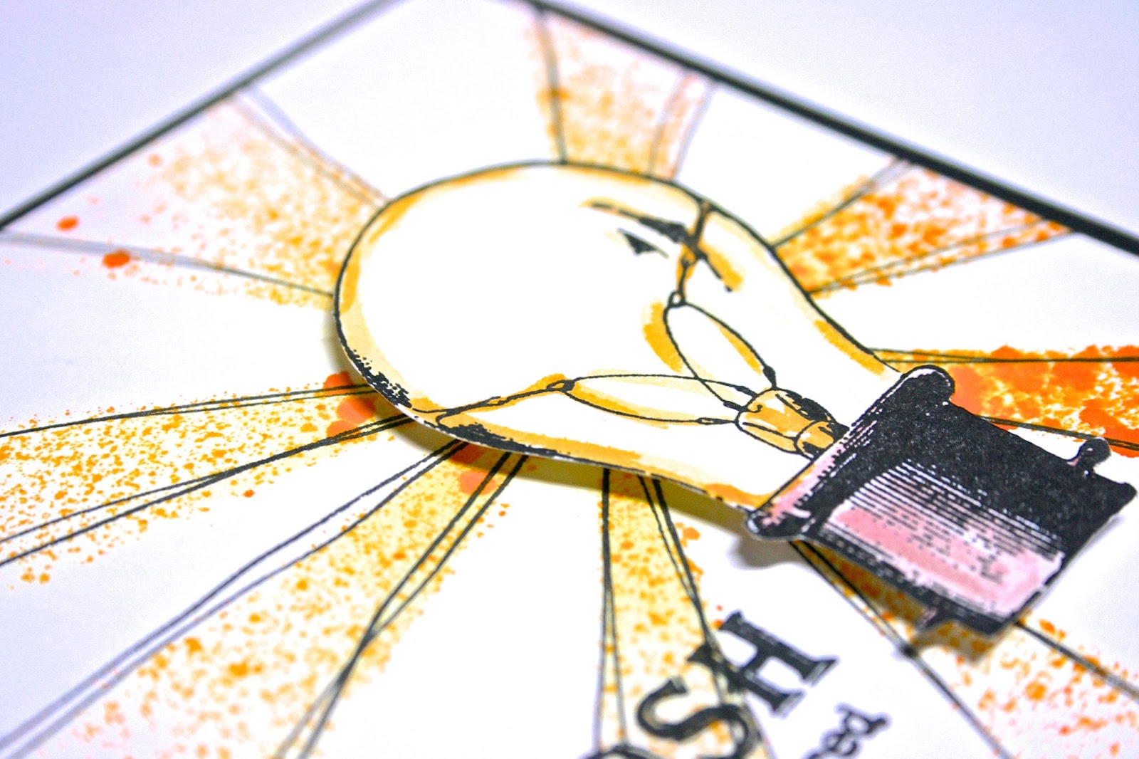
Oh Gosh - one more STENCILED card for Friends with Flair


I've just loved this last week of really intentional work with my stencils.  Hopefully I will be able to keep it up and use them more regularly!  I'm starting out on the right foot by incorporating a stencil in my Friends with Flair card.

I used the SC Sunburst stencil and incorporated both inking and misting.  I first used a sponge dauber to add a pale yellow to the rays.  Then I went over that with some Dylusions ink spray.


I really wanted to accentuate the rays and tie them in with the stamped image which is a little darker, so I just freehand doodled some extra lines along the rays.

The image was stamped with Versafine and I added color highlights using a water brush.

I have to say the one thing I'm finding and loving is that in using stencils, I am able to make a really high impact card without a whole lot of work/time.

Thanks for coming by and have a great weekend!

Supplies Used
Paper/Cardstock:  CTMH - White Daisy and Black cardstock
Stamps:  Unity - Lightbulb Moment Itty Bitt
Ink:  Versafine; CTMH - Sunkiss Yellow, Honey, Chocolate
Other:  Dylusions - Pure Sunshine Ink Spray; Studio Calico - Sunburst mask; Ranger - Waterbrush; CTMH - Dimensional Foam Tape; Tombow - Mono Adhesive

Thursday, January 30, 2014

Another Dry Embossed Stencil Card


I liked making the stencil dry embossed card from the other day so much that I wanted to try it again. This time I used one of my Dreamweaver stencils.  Since these stencils are made of metal and thicker, you get a much deeper impression which I really love.

For this card I embossed the stencil twice.  Once for the background and a second time for the fussy cut umbrellas.

For the background I colored the umbrella with Salty Ocean and Iced Spruce Distress Ink.  Then I splattered some water over the top just because they are umbrellas and they should be rained on, right?


The red/pink umbrellas were colored with Pickled Raspberry and Iced Spruce and fussy cut.

I added a little strip of cardstock with a sentiment from a Sweet Stamp Shop set and then some clear sequins to finish it off.

I'm going to link this up over at Dreamweaver's too as they are still running their CAS challenge this month.

That's all for today!

Supplies Used
Paper/Cardstock:  Avery Elle - Fog cardstock; CTMH - White Daisy cardstock
Stamps:  Sweet Stamp Shop - Perfect Match
Ink:  Ranger - Salty Ocean, Pickled Raspberry and Iced Spruce Distress Ink; Memento - Tuxedo Black
Other:  Dreamweaver's - Umbrella Background; Neat & Tangled - Clear Sequins; Tombow - Mono Adhesive; CTMH - Liquid Glass

Tuesday, January 28, 2014

Stenciled Day 4 - Dry Embossing with Stencils


One of the techniques showcased Day 4 was dry embossing with your stencils and then leaving the stencil over the embossing and inking the pattern.

This is actually one of those things I've been wanting to try and haven't gotten around to (partly because I haven't been able to locate my embossing mats.....I went deep sea diving last night in the craft room and finally located them).

I'm using one of my all time favorite stencils for this one.  Julie Balzer's Peacock Stencil by from The Crafter's Workshop.

After embossing I used Iced Spruce and Evergreen Bough distress inks.  Since the stencil is pretty detailed, I just inked up the very edge of my foam tool and used that to color the stencil, starting with the iced spruce in the center and then inking from the outside of the pattern in with Evergreen Bough.


I love the color combination and the image, and didn't want to add much else to the card.  I added some soft distressing with the Iced Spruce on the edges and a sentiment and that was all that was needed.

Supplies Used
Paper/Cardstock:  Avery Elle - Fog Cardstock; CTMH - White Daisy cardstock
Stamps:  Waltzingmouse - Fancy Feathers
Ink:  Ranger - Iced Spruce and Evergreen Bough Distress Ink; Hero Arts - Soft Granite
Other:  The Crafter's Workshop - Peacock Feathers 6x6 Stencil; Tombow - Mono Adhesive

Monday, January 27, 2014

Stenciled Day 3 - Resist


Sharing my day late card for today.  One of the techniques covered yesterday in class was using translucent embossing paste as a resist.  I don't have any translucent embossing paste, but I did learn a while back (on accident) that gesso will resist dye inks.

The only catch is that gesso is thinner and more paint like than paste, so if you are going to use gesso for this technique, I suggest a stencil that doesn't have big spaces and very thin sections of stencil separating the spaces....this could lead to spillage from one section of the stencil to another and since gesso resists, you spillage will be very evident.

I chose to use Tim Holtz's alphabet mask specifically because the negative stencil spaces are very narrow and less likely to cause a mess.  I was also pretty diligent in taping down the stencil.

Note, it also takes gesso a significantly longer amount of time to dry than modeling paste, so plan to step away for a while.

Once my gesso was dry, I added color using Festive Berries Distress Ink and Black CTMH ink.  Then I used a baby wipe to remove the excess ink.  The gesso does pick up a slight tint, so it's not pure, pure, white.

I decided to go pretty CAS for this one, die cutting the Paper Smooches Thanks die out of my stenciled piece as well as a piece of black cardstock.  I saved all the negative pieces from the stenciled die cut so I could add them back into the spaces of the black die cut to create that inlaid look.


I did end up having to run my die/panel through the machine multiple times to get a cut because the extra texture/uneven surface with the gesso plus the fact that the cardstock had lots of distress ink in it seemed to make it a little softer.

A little banner with a secondary sentiment finished this off.

I'm committing myself to one more stenciled post tomorrow for Day 4 of class, but I may go back and tackle some of the other techniques from the first couple days of class later on in the week too.

Hope your week got off to a good start!

Supplies Used
Paper/Cardstock:  CTMH - White Daisy and Black Cardstock
Stamps:  Paper Smooches - Many Thanks
Ink:  CTMH - Black; Memento - Tuxedo Black; Ranger - Festive Berries Distress Ink
Other:  Tim Holtz - Schoolhouse Layering Stencil; Paper Smooches - Thanks die; Claudine Hellmuth - Gesso; Tombow - Mono Adhesive; CTMH - Dimensional Foam Tape


Sunday, January 26, 2014

Stenciled Day 2 - Watercolors


Dropping in today to share another stenciled card.

One of the techniques from Day 2 (yesterday) was to create a stenciled background using watercolors.

I thought I would take that a step further and make the watercolored stencil the focal point instead of just the background.

I pulled out my Inktense pencils and started by painting a light wash of blue over the entire panel.  To speed things up, I used my heat gun to dry the panel.  Then I placed this Dreamweaver's Lotus Background stencil over top.  I wanted to create a scene rather than an allover pattern, so you can see that I only colored in a portion of the stencil.


Once I had the stencil taped down, I went in with my paintbrush, pulling color directly from the Inktense pencils and colored in selected portions of the stencil to create a scene.

The sentiment, from Verve, was stamped with Versafine, and to soften the transition from the main panel to the card base I added a vellum mat.

This was so easy and really a quick card to make.  I'm going to link it up over at Dreamweaver's as their CAS challenge is still going on.

Thanks for stopping by, come back tomorrow for another Stenciled card!

Supplies Used
Paper/Cardstock:  Watercolor Paper from Target; Avery Elle - White Cardstock; Recollections - Vellum
Stamps:  Verve - Grace Plain Jane
Ink:  Versafine
Other:  Derwent - Inktense Pencils; Dreamweaver's - Lotus Background Stencil; Tombow - Stamp Runner

Saturday, January 25, 2014

Stenciled Class - Day 1


I'm happy to be participated in the Stenciled class at Online Card Classes.  The class started yesterday, and I was able to get one card done last night using a technique that Jennifer McGuire shared.  I'm hoping to do one card a night for the next week or so, so be prepared for lots of stenciled cards!

The technique Jennifer shared involves rotating/shifting your stencils to create different patterns.  It's a really great way to stretch your supply of stencils.

Now I happen to have a lot of stencils, but I was surprised when I was looking for a stencil to use that I really don't have many that are an even all over pattern/symmetrical.  This is the stencil I ended up using.


You'll notice that it doesn't take up the whole width of the card, but I thought it would kind of work out in terms of a fade in/fade out with the new pattern in the center.

I'm pretty pleased with how it turned out.  I kept it really simple, just added a sentiment and some sequins.

That's all for tonight.  We have literally been on the go all day, so I've got to get to work if I'm going to get a card done tonight.

Supplies Used
Paper/Cardstock:  Avery Elle - White, Sapphire, and Raspberry Cardstock
Stamps:  Mama Elephant - Smitten
Ink:  Ranger - Pickled Raspberry and Salty Ocean Distress Inks; CTMH - Pacifica
Other:  Studio Calico - Chevron Stencil; Neat & Tangled - Translucent Sequins; Tombow - Mono Adhesive; CTMH - Dimensional Foam Tape and Liquid Glass